White Paper
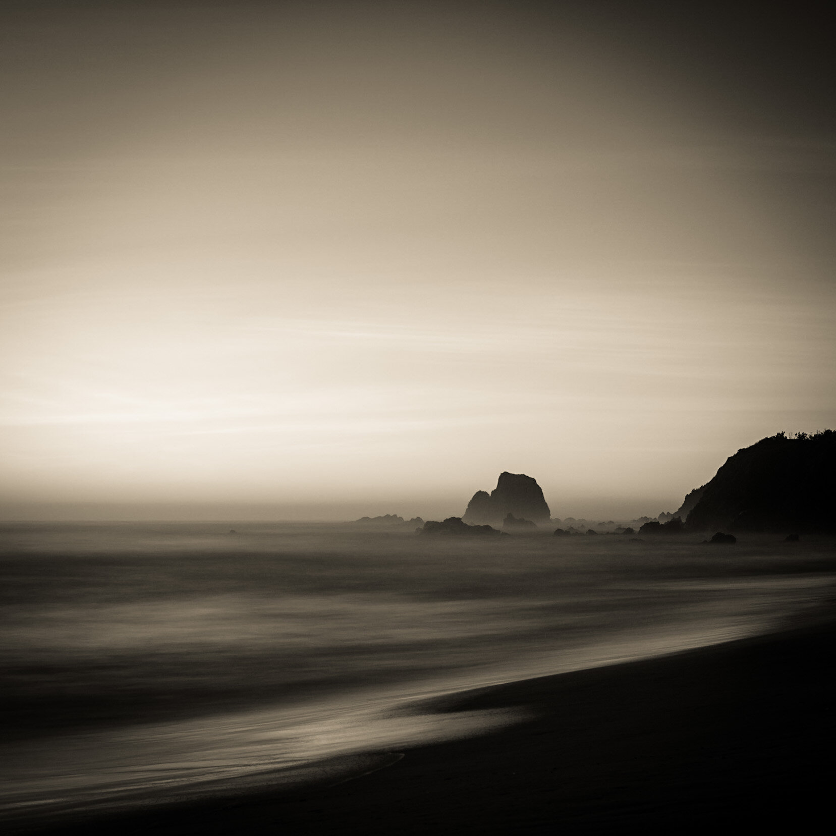
I have just spent the last half hour searching through photographs to find one to post. Another purple haze surfaced, but as I stared at it I couldn’t remember where I had taken it. So then I turned back to some recent work in the snow.
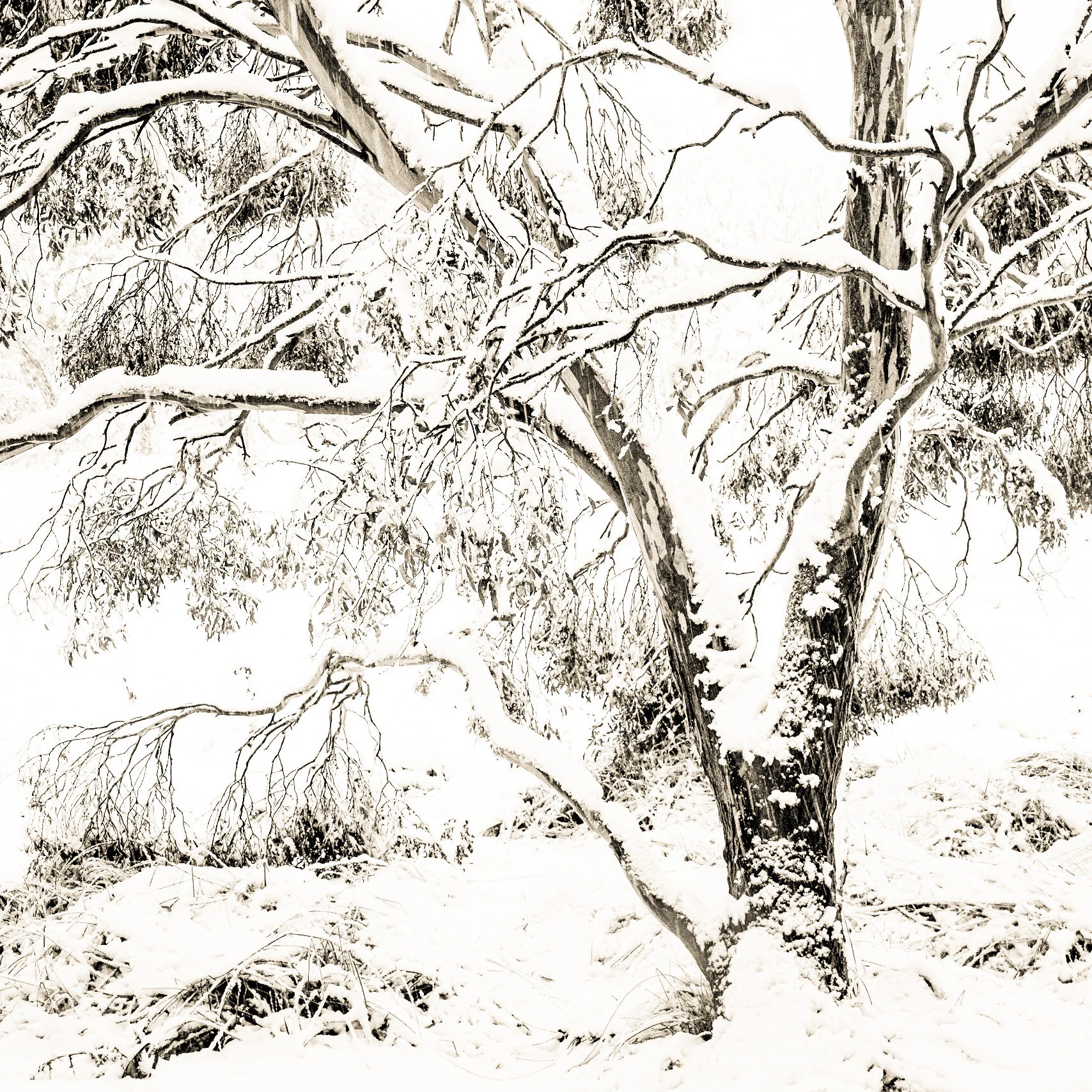
This one popped up. And after yesterday’s long discussion about high key photography with the members of Len’s Club I decided to revisit my processing. I decided to let go of my insistence in keeping details in the whites.
Stuff it… just blow them out intentionally… Celebrate the white paper they are printed on. Well, off white if the truth be known. Overly contrasty monochrome’s just don’t sit well with me. I prefer subtle. I do wonder if it’s my Dyslexia or my true inner nature that prefers gentler works of art. Ones that creep up on you. That catch you unawares and suck you in gently.
With the dyslexia I read better in subdued light with less contrast so that I don’t get so distracted by the rivers of white lines that swirl around on a page of text.
Looking at this right now, I think I could lift the darks a bit more. Lighten it up and forgo black and go for a mid sepia.
Some are just never finished are they. We are best to walk away after printing them and let them sit for a while.
Don’t be scared of the white paper like we are told by the so called gate keepers of photography. Celebrate its beauty. I must put a gorgeous collection together to celebrate ‘white’.
Posts are much less often atm. My apologies. That is just how it is. Clair and I are working hard behind the scenes working out a marketing plan and done fantastic new things. We will be sharing them with you shortly.
Snow Gum. Thredbo Diggings. Snowy Mountains. Photograph and text copyright © Len Metcalf 2020
addendum - which one do you prefer? Version 2 leads the post, and versions 1 & 3 follow bellow.
Version 3. Lifted the blacks a bit more
Version 1 - poor attempt at keeping detail in the snow. Looks a bit muddy to me.


