Less is more
I am trying to write snippets from larger ideas so that one day they will form a cohesive body of work. Much in the same way I collect photographs that can go into project portfolios. Today is the start of a new chapter on minimialism. You May have noticed many on Creativity, in between other rambling thoughts. Rather than working cohesively on one subject for a length of time I will continue to go seemingly randomly adding bits here and there. I work better that way and I think it will be more interesting for you as a reader. Most of my readers enjoy the daily aspect of what I am currently doing. From what I can tell, we have over 500 readers now. Daily letters of thanks and discussion are now the norm. Without these I doubt my enthusiasm would have lasted, I am truely thankful for every one.
Less is More
One idea is that it’s what you leave out of an artwork that makes it work. Painters add with brush strokes, performers with words and movements while photographers use framing, focus and exposure to eliminate the un necessary.
The question arises about what to include and what to leave out. How much do you include to communicate your thoughts and feelings? As we start our learning journey we tend to include so much. Latter as we master depth of field we start to cut out things using out of focus as a method of removing the unnecessary. We may even spend lots buying faster lenses with softer bokeh to emphasise the main subject through isolation even more.
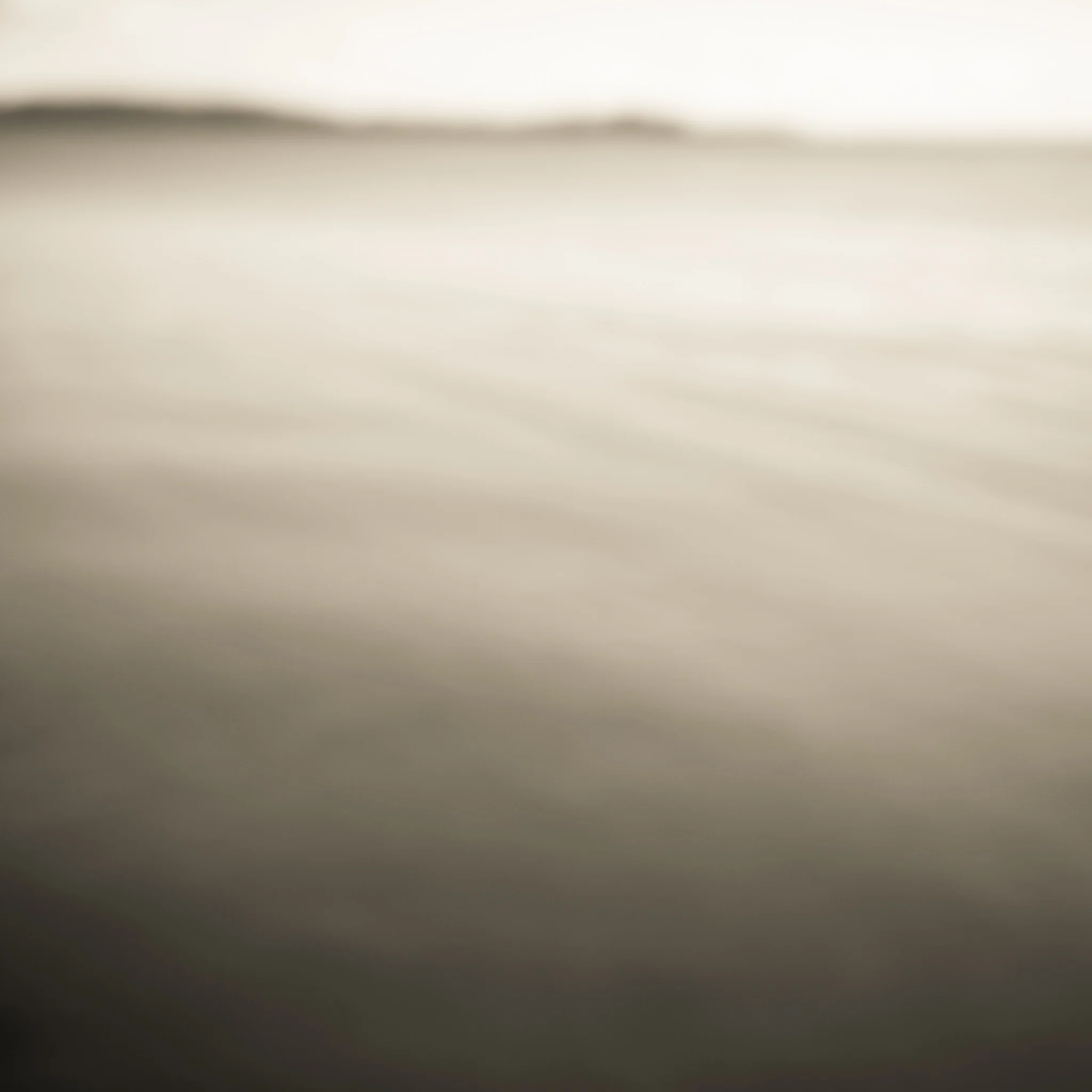
Latter still we may even try high key as a way of removing details and distractions. Another is using abstraction to remove elements, as I have done in this photograph.
The most important one that is the common element between them all is composition. Framing. The edges. What goes in and what is left out. The visual arrangements.
After years of practice and exploring I can confirm that usually the less you put in the stronger the outcome is, and the more powerful the artwork becomes.
One question to ask yourself is “Does it help or hinder your artwork?”
Leaving out elements and details makes art more impactful and creates more mystery for the viewer. This is a win / win situation for the artist as if we can work on both of these elements at the same time the quality of our work can soar. It’s a secret that this is a magical combination, making your work more impacting and more mysterious at the same time. No wonder it works so well.
While we are on secrets, I only just figured that out as I wrote it down. It’s a thought that has been swirling around in my head about getting impact and contemplation into artworks at the same time.
Julia Cameron is right. Morning pages are special. The artists way - I will talk about these another day.
South West Rocks from the Abstract Photography Workshop last year. I am interested in producing a monochrome series of expressionistic art. This years workshop is starting to fill up. Click here for more information. Photograph and text copyright © Len Metcalf 2018


